


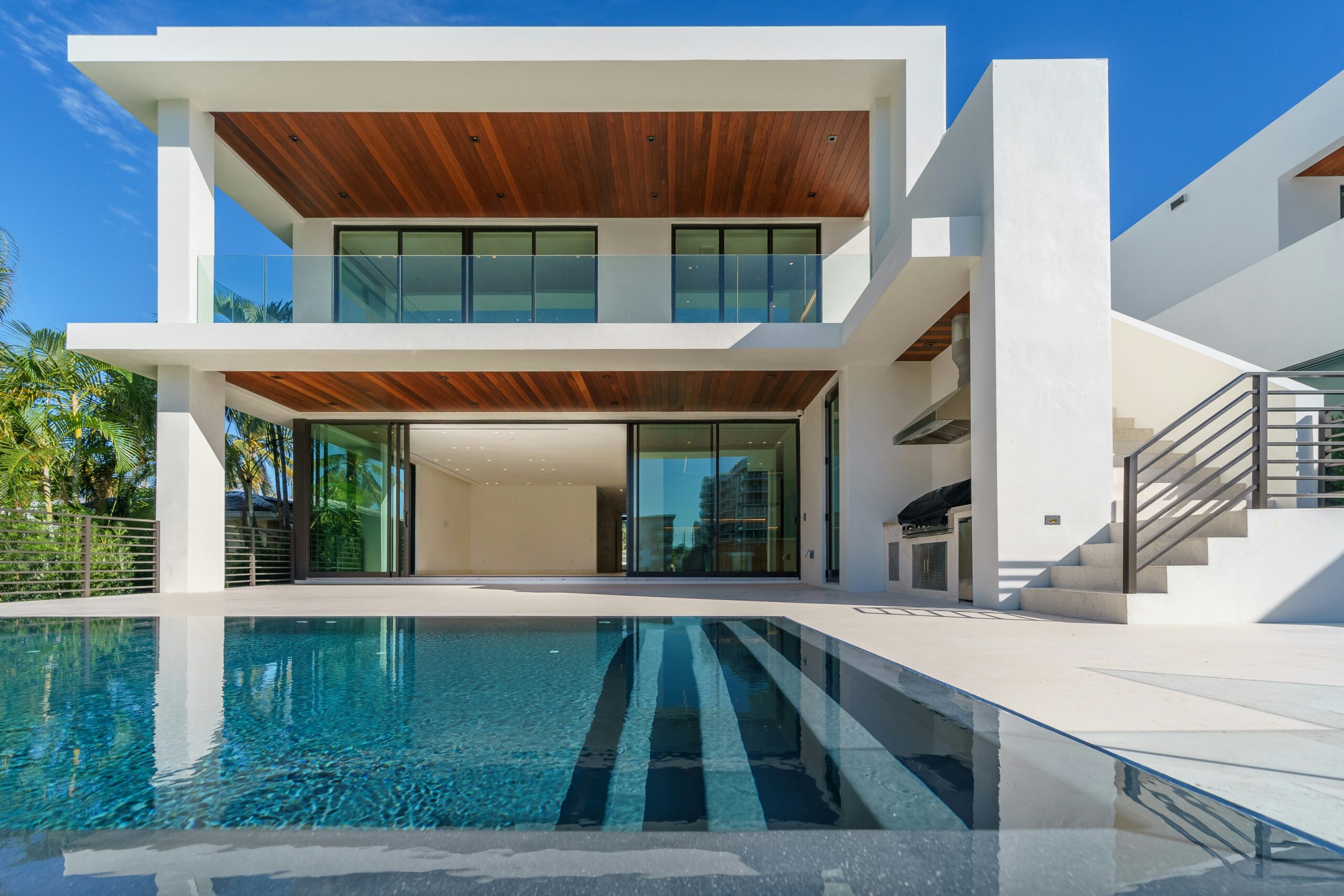
Giving your home’s outside a fresh coat of paint or a new look is one of the biggest changes you can make. The right colors don’t just boost your home’s curb appeal; they can make you smile every time you pull into the driveway. But with thousands of shades out there, picking the perfect palette can feel totally overwhelming. A great exterior color scheme is more than just choosing a color you like; it’s about creating a cohesive look that really suits your home’s architecture and its surroundings.

Start with Your Home’s Style
Before you even glance at paint chips, take a good, honest look at your house itself. Its architectural style is a natural starting point for choosing colors. For example, a historic Victorian can totally pull off complex, multi-color palettes that show off its intricate trim and details. On the flip side, a sleek, modern home might look best with a bold, single-color scheme or a sharp contrast like charcoal gray and natural wood.
Also, think about the parts you can’t easily change. Do you have a brick or stone facade? Those materials come with their own colors and undertones that you’ll need to work with. A red brick home often looks beautiful with warm neutrals like beige, cream, or even a deep forest green. The idea is to pick colors that celebrate your home’s original design, not fight against it.
Understand Color Undertones
Every color has a subtle underlying hue, or undertone, that makes it feel either warm or cool. A beige might have a yellow (warm) undertone, while a gray could lean blue (cool). The secret to a harmonious color scheme is making sure all your chosen colors share compatible undertones. This goes for everything from your siding and trim to your front door and roof. A common mistake is pairing warm-toned siding with a cool-toned stone accent, which can make the whole thing feel “off” even if you can’t quite put your finger on why.
This is important when you’re picking materials that will last for decades, like your roof. Even neutral shingles have complex undertones. Looking at a detailed CertainTeed shingle color comparison, for instance, can help you spot the subtle differences between shades that might look similar at first glance. Understanding these little details ensures your roof color really works with your overall vision. You can learn more about how to choose the best exterior paint colors to nail this part.
Consider Your Landscape
Your home isn’t just floating in space. Step back and consider what’s around it. The natural landscape, your garden, and even your neighbors’ homes can all influence what colors will look best. A house tucked away among lots of trees and lush greenery might look stunning in earthy tones like deep greens, warm browns, and muted ochres that blend right into the environment. A home in a sunnier, more open area might be able to pull off lighter, brighter colors that reflect the light.
Also, take a peek at the houses on your street. While you definitely don’t need to match them, you probably don’t want your home to clash dramatically. A good approach is to pick a palette that stands out just enough to have its own personality, but still feels like it belongs in the neighborhood.
Test Samples in Different Light
Never, ever pick an exterior color based on a tiny paint chip you saw under the fluorescent lights of a hardware store. How a color looks outdoors is dramatically different, and it changes throughout the day. The bright, direct sun at midday can wash a color out, while the soft, warm light of the evening can bring out its deeper tones. And any shaded areas will make a color appear darker and cooler.
The best way to really see how a color will look is to test large samples. Paint a few big poster boards with your top choices and move them around to different sides of your house. Check them out in the morning, at noon, and in the late afternoon. This is the only way to be sure you’ll love the color in all conditions. This process of picking an exterior color takes some time, but it saves you from costly regrets later.
Coordinate All Elements
A successful exterior design considers every single element as part of one big picture. Your siding, trim, shutters, front door, and roof should all work together. A good rule of thumb is to create a palette of three to four colors:
- Field Color: This is the main color for the body of your house.
- Trim Color: A lighter or darker shade used for window and door frames, fascia, and eaves.
- Accent Color: A pop of color for the front door or shutters to add some personality.
- Roof Color: The foundational color that anchors the entire scheme.
Since the roof can make up as much as 40% of what people see from the curb, its color is an important decision. It should coordinate with your other choices and is often the best element to pick first, since it’s the most permanent. From there, you can build the rest of your palette to create a beautiful, unified look you’ll love for years to come.
Choosing a new look for your home’s exterior is a big project, but it doesn’t have to be stressful. Taking a thoughtful approach and considering all the elements helps you create a look that feels both fresh and timeless.

